Water Vizsualization (2012)
(2012)
Cláudia Oliveira
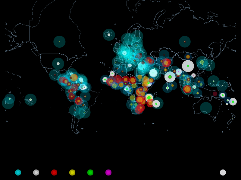
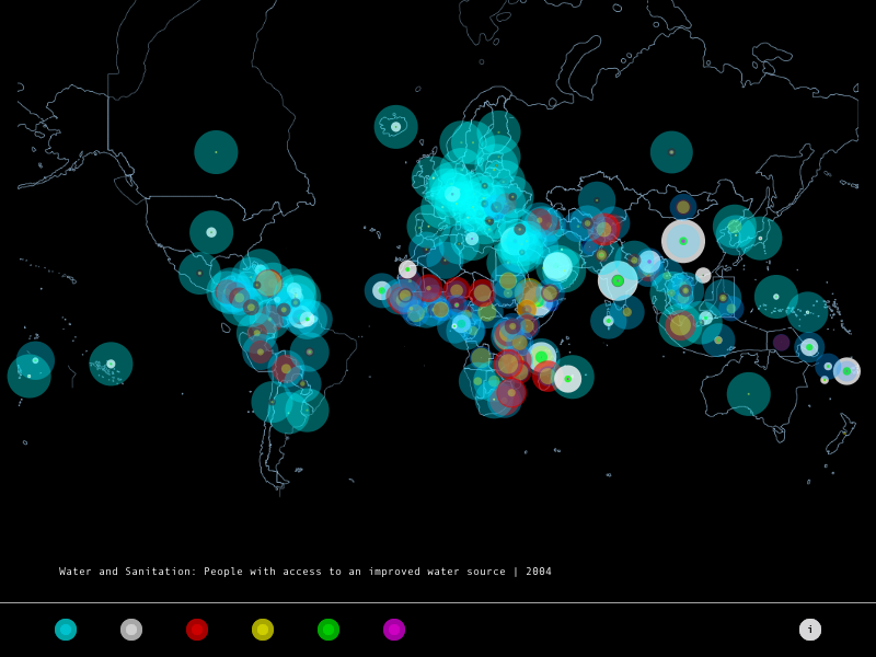
The main goal is to relate the percentage of people with access to water and sanitary conditions (blue markers) with the poor and undernourished people from each country (red and yellow markers). On the other side, it´s possible to identify the population distribution(white markers). Thus, it´s possible to compare the countries area with their stocking, identifying which countries have a large concentration of people. India, for example, is a highly populated country compared with the United States that has a greater area but a lower turnout. It´s even possible to identify the amount of young and old population (green and purple markers). So, this visualization identifies the impact these conditions in the society, regarding the distribution of population. Altogether, there are related 186 countries around the world.
Analyzing:
– There´s a relationship between the ability to access water sources and sanitary conditions with the percentage of poor and undernourished people. The smaller the access, greater it´s the poverty and malnutrition;
- The greater the poverty, the greater the malnutrition;